Case study 02 · Deaku, AI-native creator workspace
From measuring the funnel to rebuilding the page

My version: the problem, the workflow in seven stages, then one call to action.
- Role
- Product engineer: research, structure, copy, visual design, build, instrumentation
- Team
- Two founders, founding technical lead, me
- Timeline
- September 2026 · designed and built in two days
- Tools
- Next.js, TypeScript, Tailwind, Web analytics, Claude Code
Key results
- Found the leak: 96 in 100 visitors never started sign-up, while the form itself converted 70%
- A 20-screen feature tour became one focused page; its structure, pricing logic and tracking are live
- Every section and CTA instrumented, so the next change is argued from evidence
What you’re looking at
My version of the page, and what’s live today.
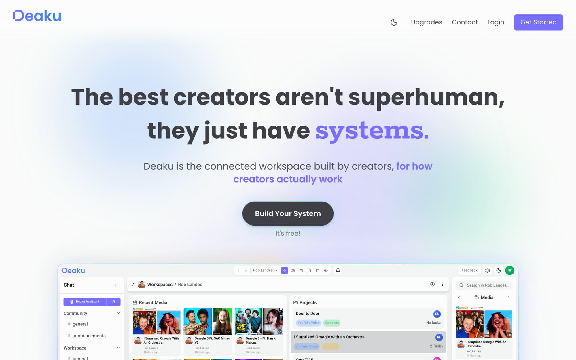
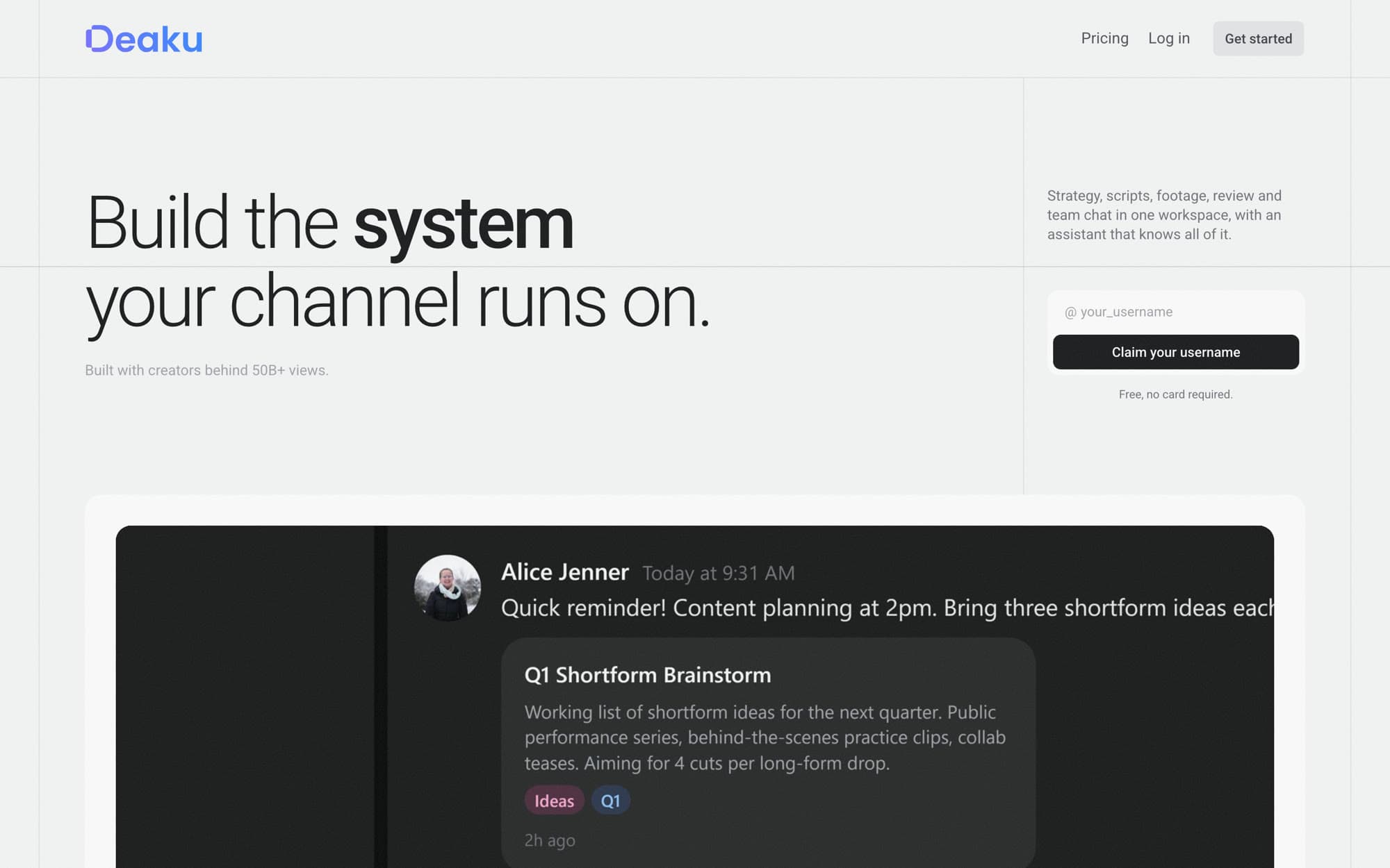
I designed and built this page in two days, and the team approved the structure. Before launch, a founder restyled the visuals to match the brand. The structure, the pricing logic and the instrumentation I built are what’s live today. This case study shows my version.
It was the first fix to come out of a larger piece of work: defining Deaku’s funnel and KPI tree, which is a case study of its own.
Me
Research, structure, copy, design, build, instrumentation
Two founders
Brief, brand, final say on visuals
Founding technical lead
Event system, review
The problem
Nobody could see where visitors were leaving.
Deaku had no reliable picture of how a visitor became a paying customer. While building the KPI tree I asked for access to the analytics and looked at the landing page.
- Visited the landing page
- 100
- Started sign-up
- 4 in 100
- Created an account
- 7 in 10 of those who started
Eight weeks of traffic. Ratios only; visitor numbers are confidential.
People who started sign-up mostly finished it. The leak was the landing page.
- Phone share of visitors
- 33%
- Phone share of sign-up starts
- 14%
Phones started sign-up at under half the desktop rate.
- Almost nobody engaged with the content. The hero video and the feature grids were opened a handful of times.
- The tracking was half blind. Only two of the page’s entry points were measured, and one event watched an element that no longer existed.
A page working against the visitor
The page was a 20-screen feature tour with seven feature grids and several competing calls to action. It described what the product had without saying who it was for or what problem it solved. The team’s own read was the same: the demos were overwhelming, and the page should lead with the outcome.
01 · Research and brief
Agree the structure first. Taste can differ later.
Before touching the page I researched what high-converting SaaS landing pages share, and gave the team a structure to react to. We agreed that style could be argued and tested freely, as long as it stayed within this skeleton.
02 · One story, one action
From a feature tour to a page with one job.
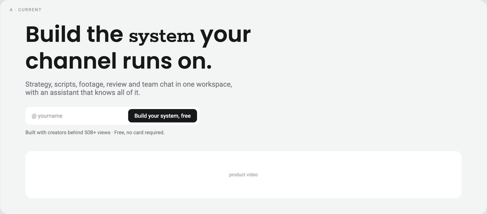
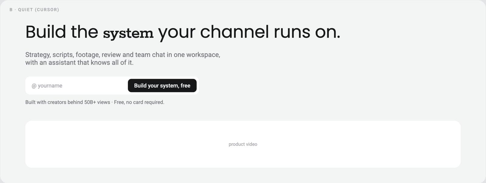
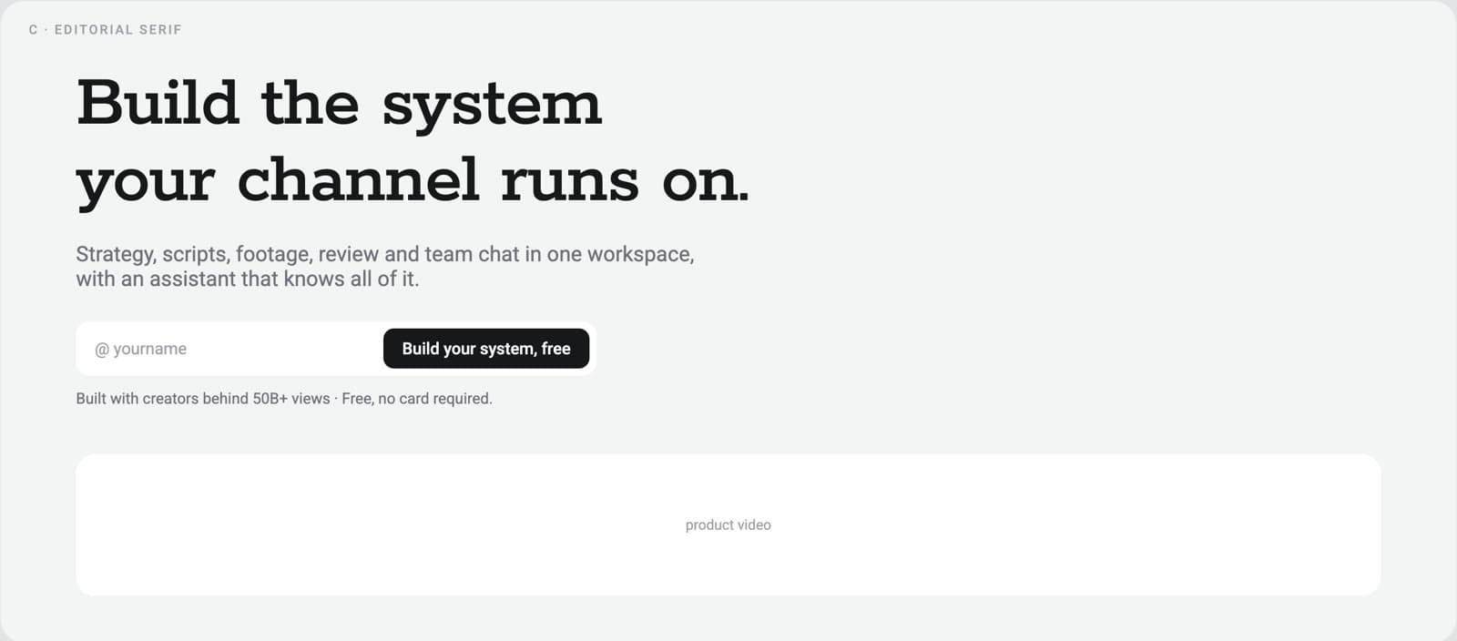
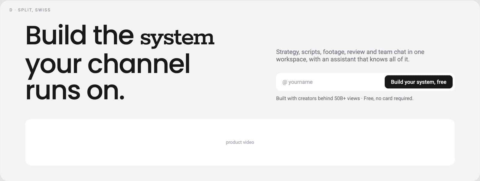
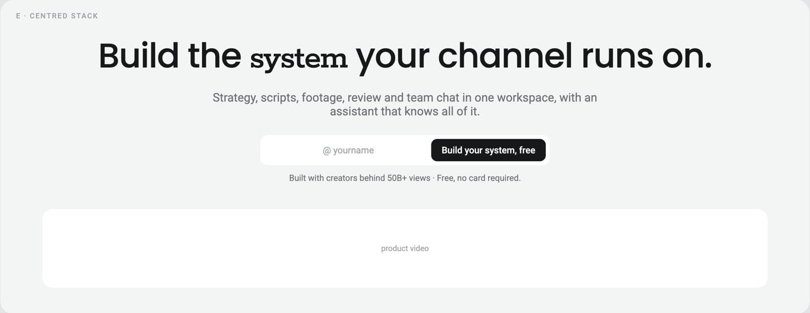
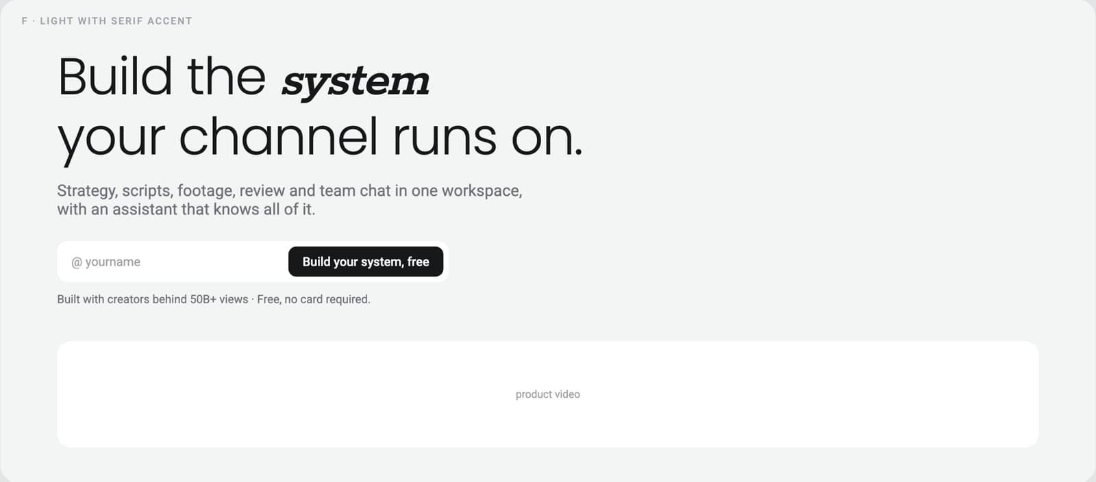
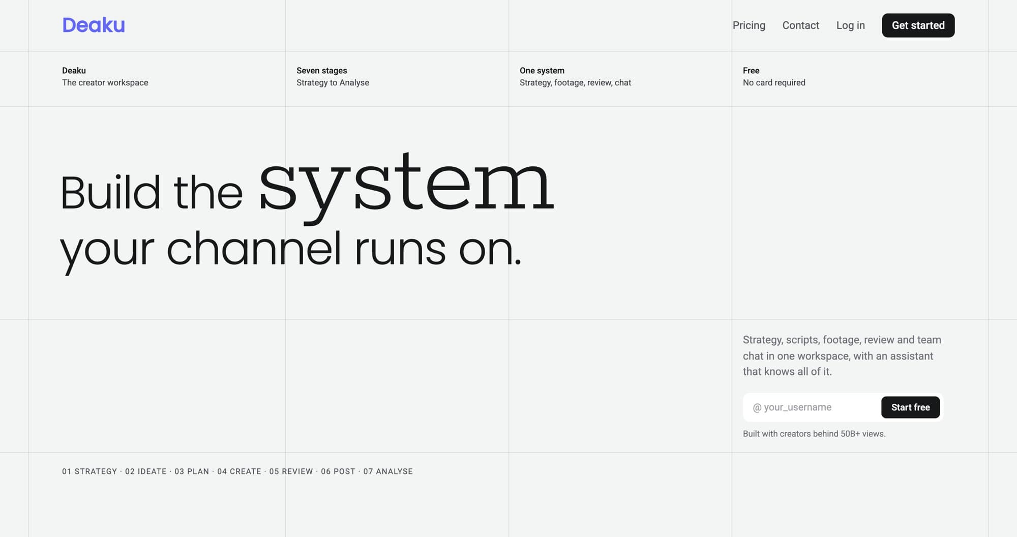
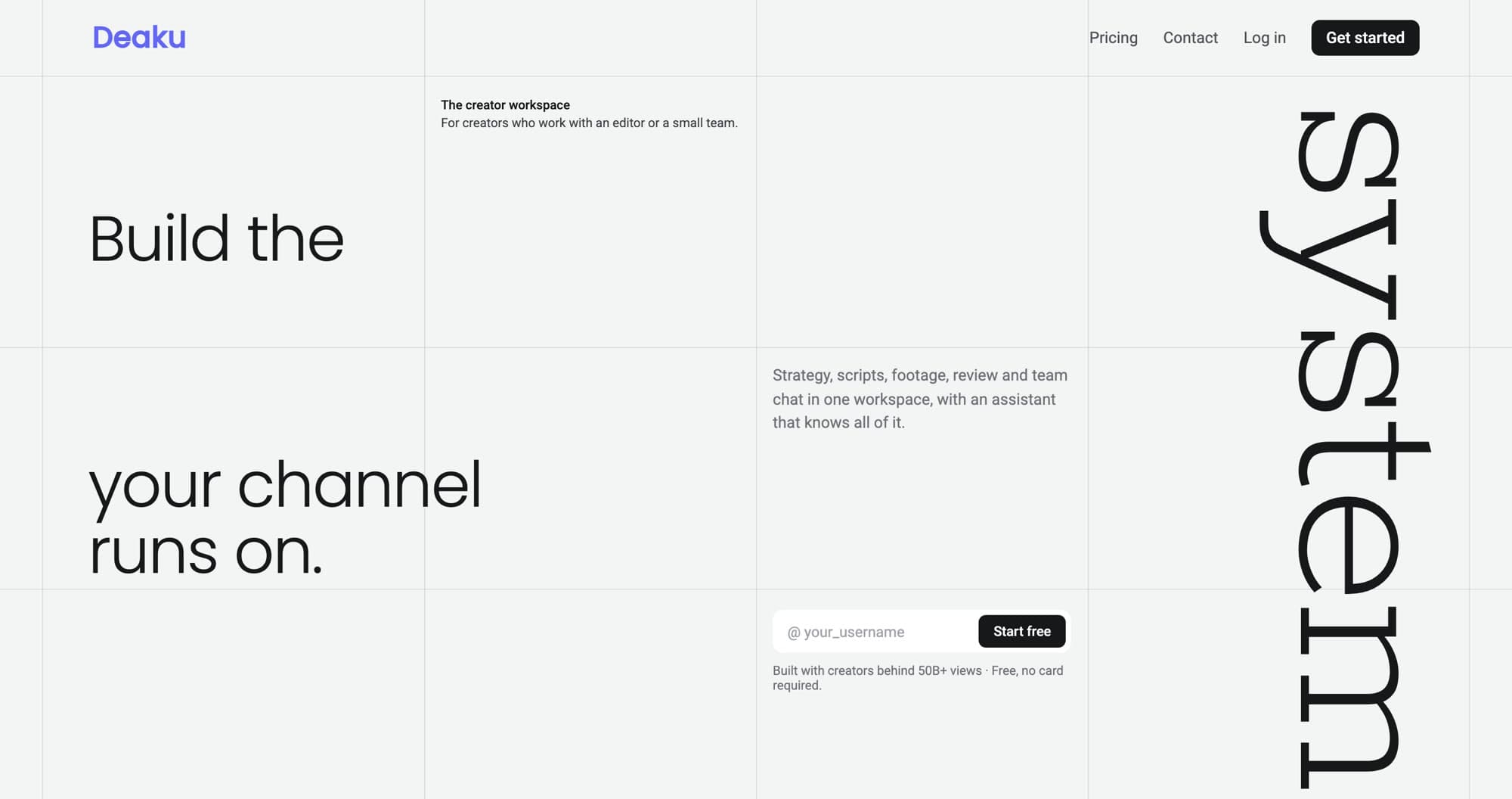
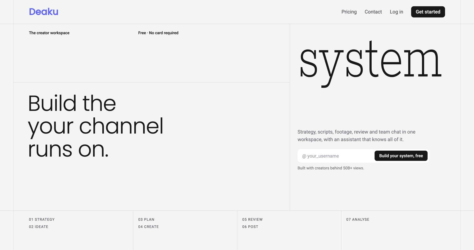
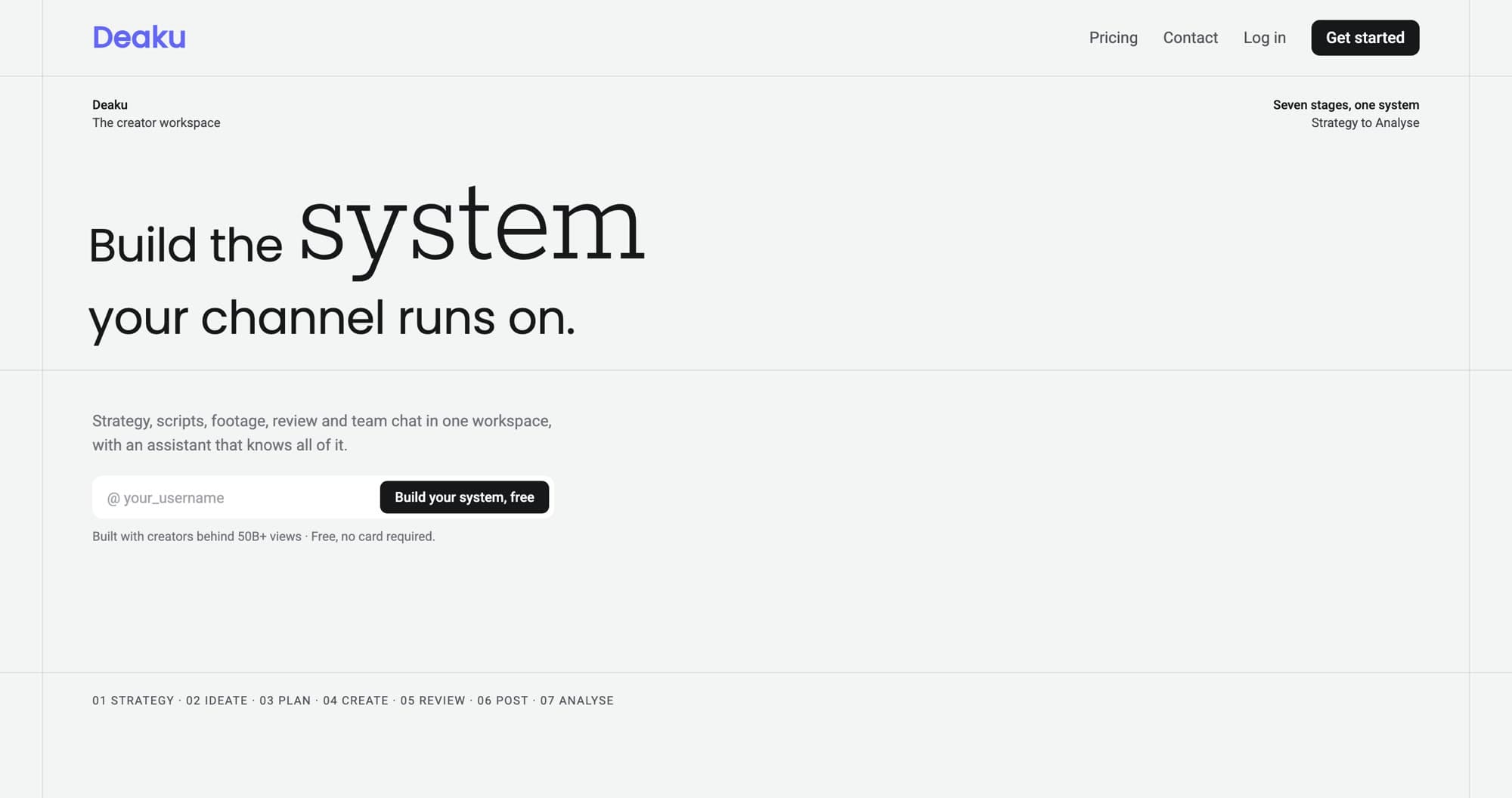
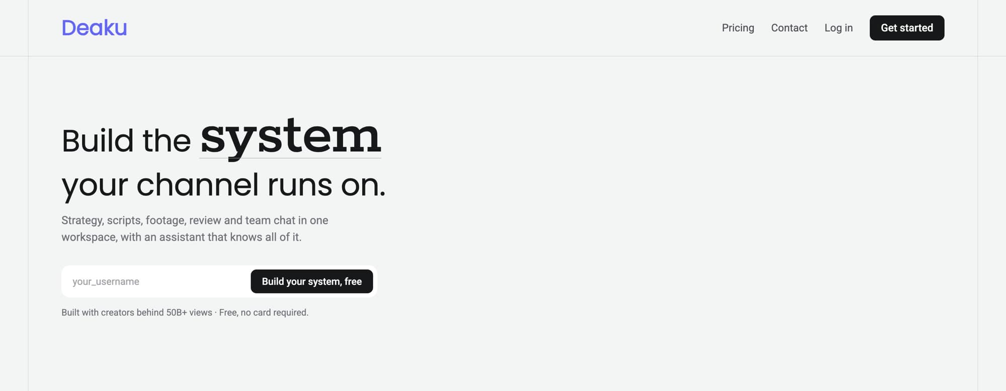
The rebuild follows that sequence and reuses existing demos wherever they earned their place. The headline moved from something philosophical to something a creator can act on: “Build the system your channel runs on.”
Exploring the hero in code
Deaku has no Figma. I design in code against the team’s living style guide, so explorations are real HTML that can be compared side by side and taken straight into the build.
One call to action
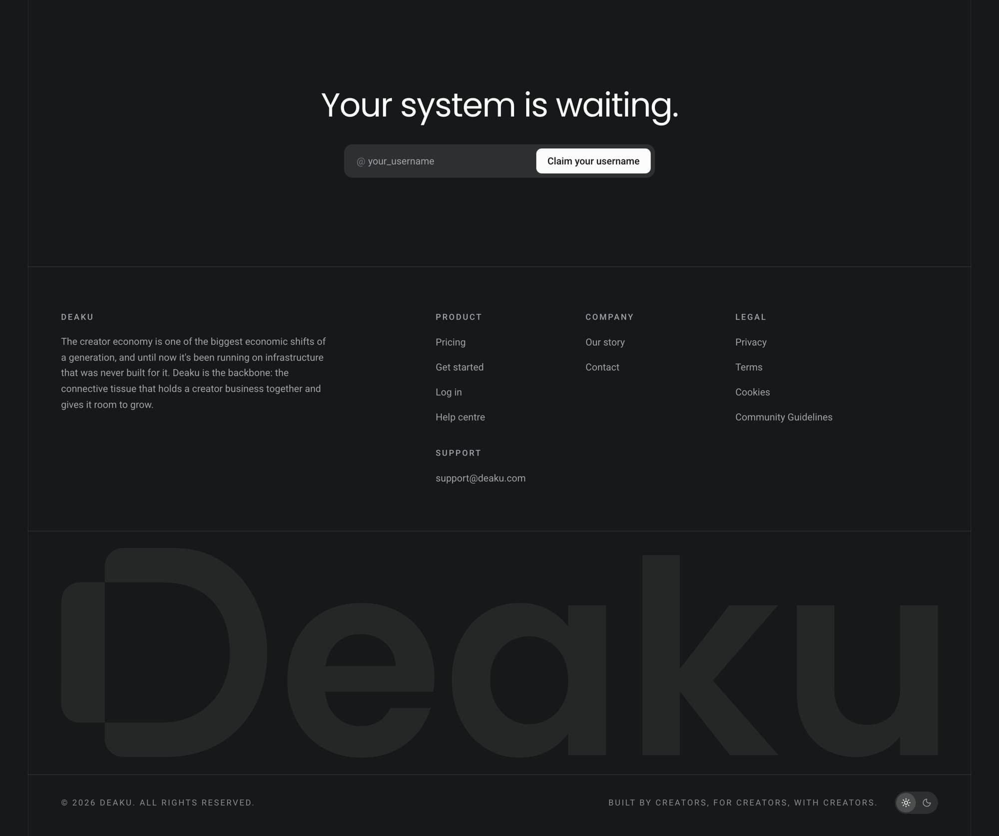
“Claim your username” everywhere. It’s low-commitment and personal, and the @ prefix makes it feel like something you already own. Every pricing button pre-selects its plan at sign-up, which removes a step.
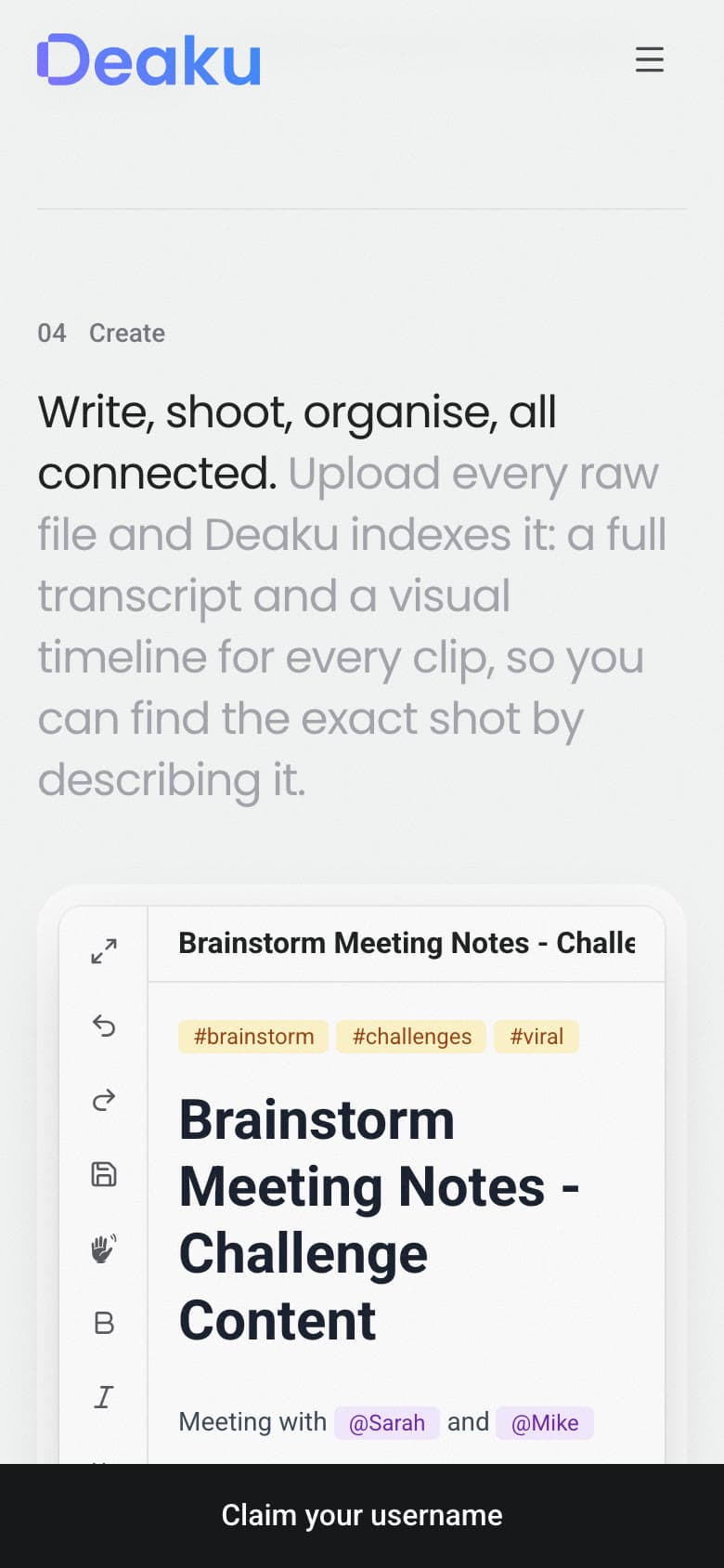
On phones, where sign-up starts lagged most, a full-width CTA bar appears only after the hero’s CTA scrolls away, and hides when the final CTA is on screen. There is never more than one CTA visible.
Key decision
Which plans to show.
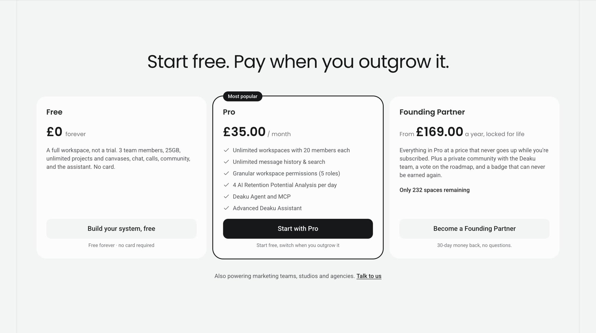
Five things could plausibly be called plans: Free, Pro, Founding Partner, Scale and Network Partner. Showing all five would turn pricing into a spreadsheet. My first version showed the launch offer, Founding Partner, as its own card.
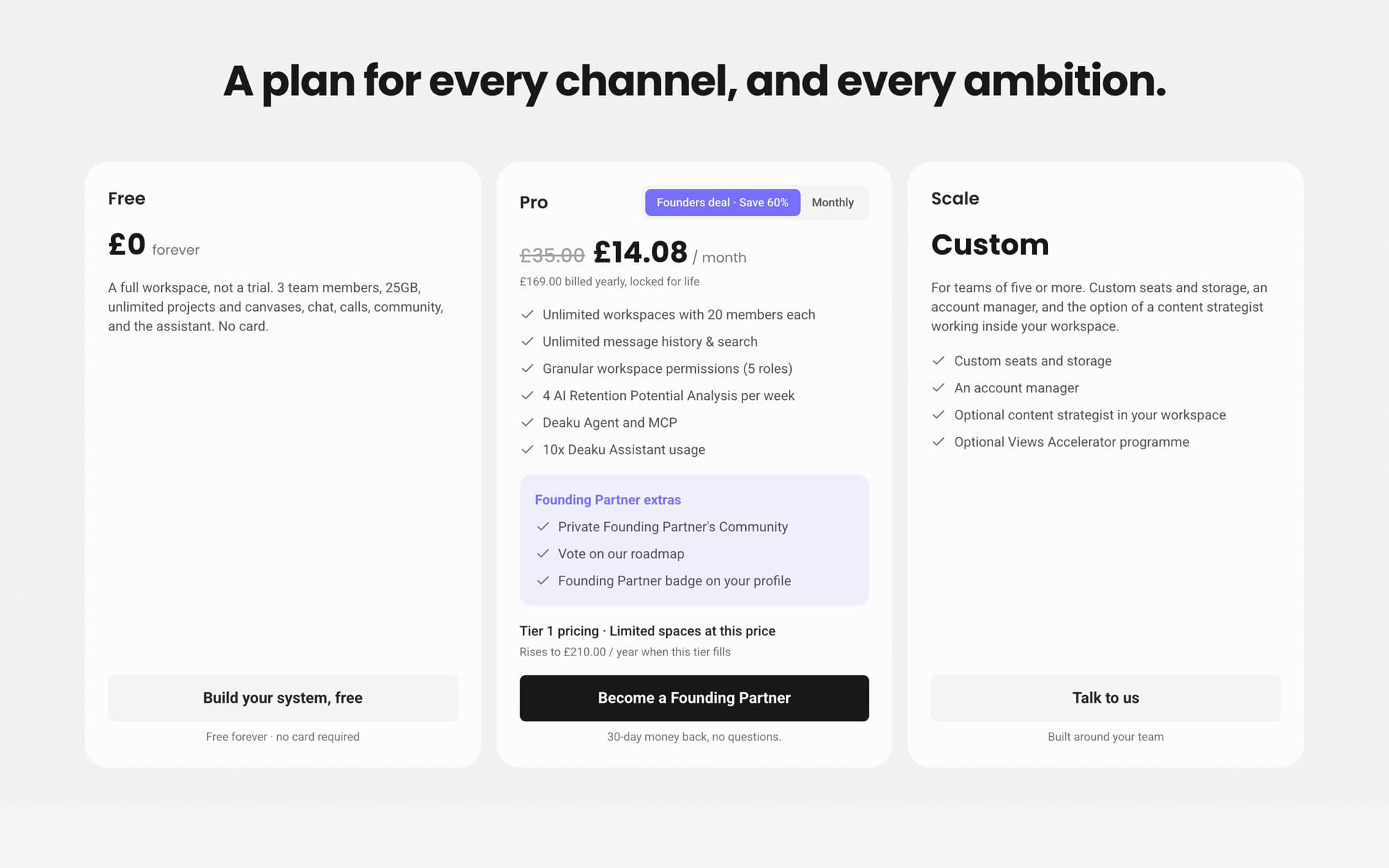
I argued for Free, Pro and Scale, because each maps to a different customer: someone trying Deaku, a creator running an operation, and a larger team. The other two aren’t plans:
- Founding Partner is a launch offer on Pro. As its own card, the visitor never sees what Pro normally costs, so the discount has nothing to be a discount against. It belongs inside the Pro card. When the seats sell out, you delete a line instead of redesigning the section.
- Network Partner is a sales conversation with businesses buying accounts for other people. It belongs on the pricing page and as one line under Scale.
03 · Visual concept
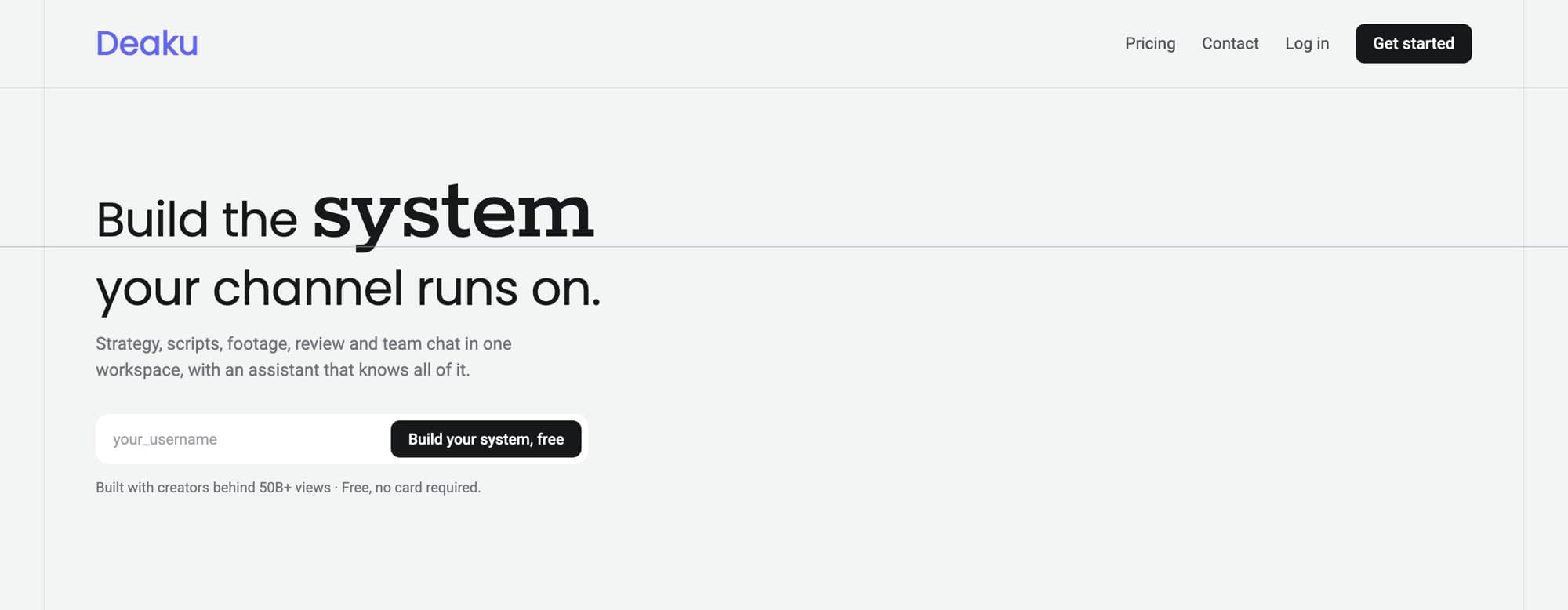
The lines draw the promise.
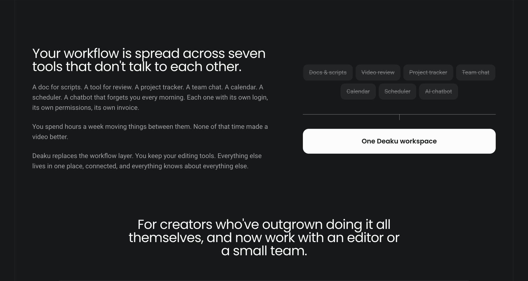
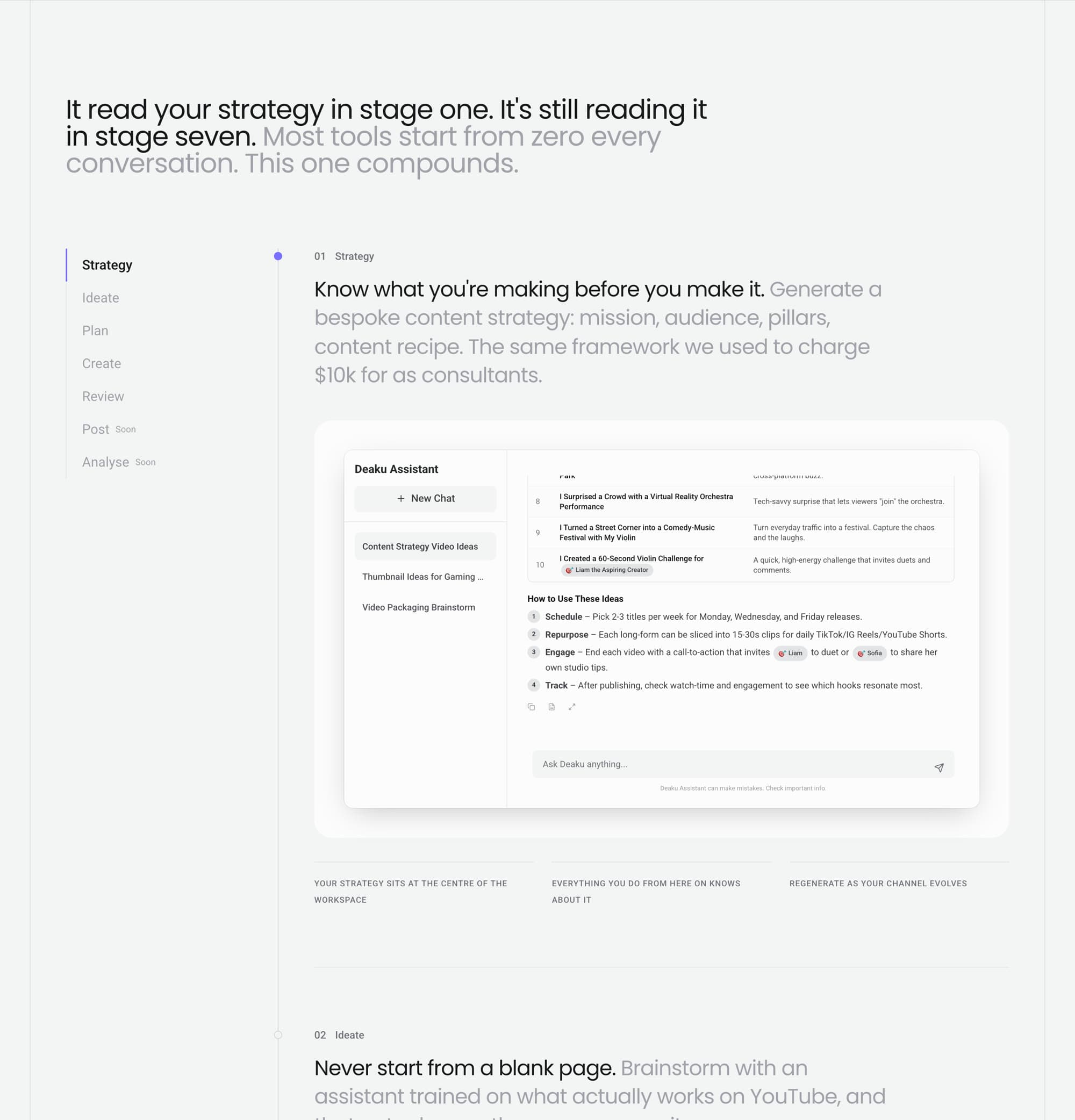
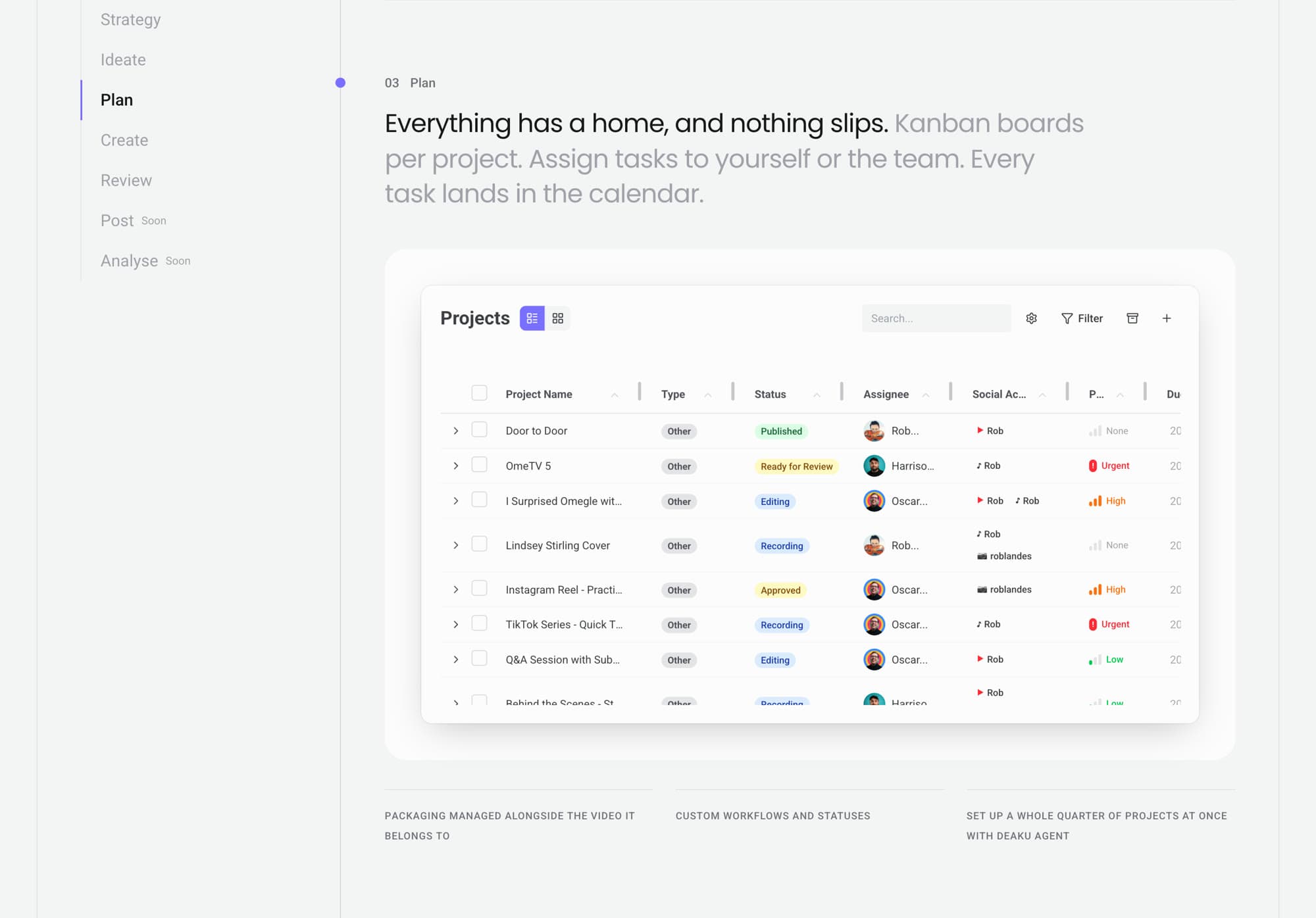
Deaku’s promise is that scattered tools become one connected system. I built the page on a Swiss grid and let the grid tell that story.
- The grid is the system. Faint hairlines run down the content edges and mark the top of every section.
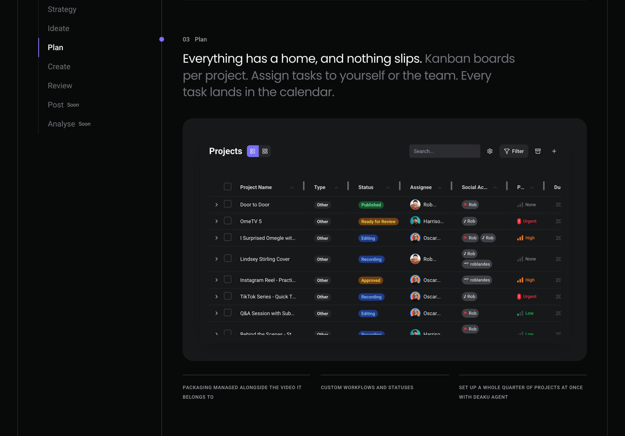
- A thread through the stages. One line runs from Strategy to Analyse, with a node at each stage. The node you’re reading fills with the brand accent, the only accent on the thread.
- Disconnected to connected. Under the seven crossed-out tools, scattered segments level into one line. It’s the page’s only line animation, and it’s off for reduced motion.
04 · Built to hold still, and to be measured
Fast, stable and instrumented.
- No layout shift. Every demo reserves its final height in CSS, so the server HTML is already correct and nothing moves as content loads. Checked in Chrome and WebKit at 390, 768 and 1440px.
- Lazy loading. Heavy demos load only when they come near the viewport. The hero video plays only while on screen.
- SEO and accessibility. One h1, structured data for the app and the FAQ, and motion that respects reduced-motion settings.
/**
 * Either the mock has its own phone layout, with a measured height to reserve
 * on phones, or it is scaled on phones too. One of the two is required, so a
 * box can never start at zero height.
 */
type FitToWidthProps = SharedProps &
  ({ phoneHeight: number; scaleOnPhones?: false } | { phoneHeight?: never; scaleOnPhones: true });

// The box's height, in CSS only, so it is right in the server HTML and never
// changes. Phones: the mock's own layout height. From `sm` up: the design
// aspect ratio, capped at maxScale.
const boxStyle = {
  '--fit-phone-height': phoneHeight === undefined ? undefined : `${phoneHeight}px`,
  '--fit-max-height': `${designHeight * maxScale}px`,
  aspectRatio: `${designWidth} / ${designHeight}`,
} as CSSProperties;

// Which layout to render inside; nothing renders until the client has measured.
const { content } = (() => {
  if (!isNear || containerWidth === null || isPhone === null) return { content: null };
  if (isPhone && !scaleOnPhones) return { content: children };
  const scale = Math.min(containerWidth / designWidth, maxScale);
  return { content: <div style={{ width: designWidth, transform: `translateX(-50%) scale(${scale})` }}>{children}</div> };
})();Measurable at a finer grain
I wired the events that had been missing. Every section is tagged; the tracker records section views, the deepest section reached and the last one seen before leaving. Every CTA click records which section it came from, so the hero, sticky bar, pricing and final CTA can be compared.
The old page stayed live at a fallback route, so the team could compare or revert with a one-line change.
Results
Launched this week. Here is how I’ll know it worked.
The page went live on 30 September 2026. Deaku is an early-stage product, so a reliable reading takes about eight weeks. I’ve set the measures and targets now and will report against them.
| Measure | Before | Target | Why |
|---|---|---|---|
| Visitors who start sign-up | 4 in 100 | 6–8 in 100 | The main leak |
| Phone share of sign-up starts | 14% | 25% or more | Phones are a third of visitors |
| Sign-up completion | 70% | Stays at 70% or above | Guardrail: more starts shouldn’t mean worse starts |
Already true: the structure, the three-plan pricing and the section tracking shipped, and the team can now see where visitors leave, not only whether they converted. The sign-up flow was rebuilt too, on my recommendations: the founding technical lead implemented it and I reviewed it.
Reflection
What I’d do differently.
- Agree the brand boundaries as well as the structure. We agreed the skeleton up front, and it held. The visuals were restyled after my hand-off; a short brand check before building would have saved that second pass.
- Next: an A/B test on the main CTA once there is enough data, and reading the section data to decide what to cut.