Case study 01 · Vigorant, Borna Care, US healthcare SaaS
Two healthcare MVPs, designed from scratch
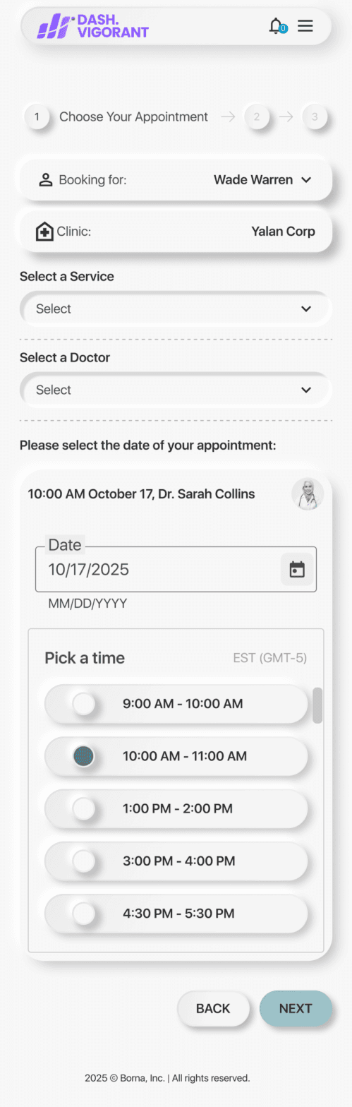
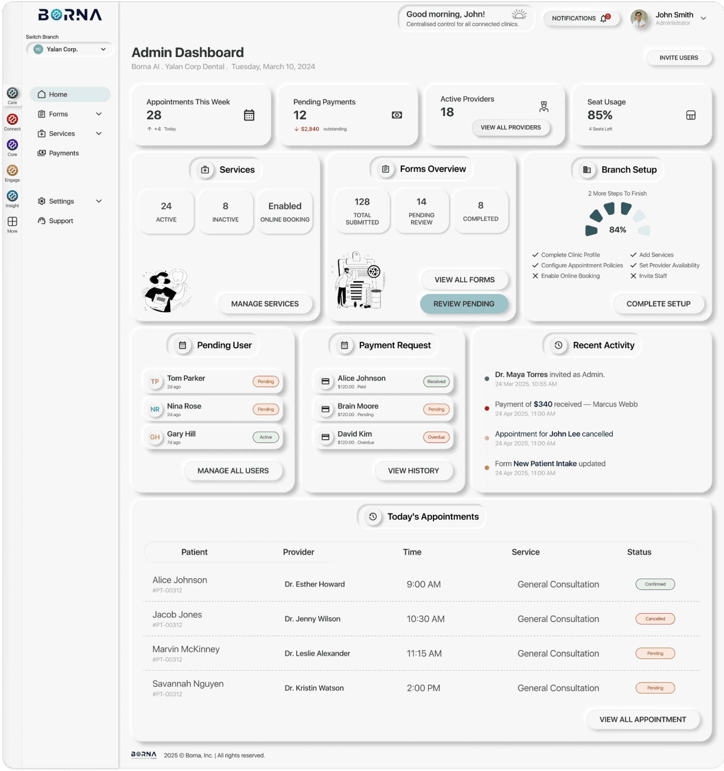
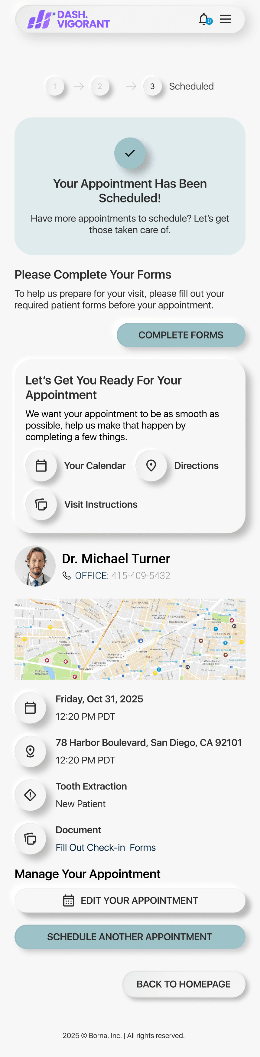
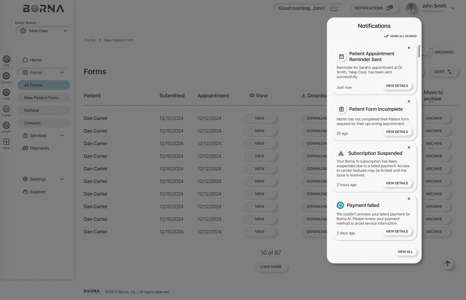
Sarah opens Borna Care at 11pm and books her dental appointment without calling anyone. She picks her service, doctor and time slot in under two minutes.
- Role
- Lead product designer (UX/UI), front-end contributor
- Team
- Founder, product manager, back-end/DevOps and front-end developers, supporting designer (mentored by me)
- Timeline
- Nov 2025 – Feb 2026 to MVP · contract Oct 2025 – Mar 2026
- Tools
- Figma, Design system, React, TypeScript
- Live
- borna.ai
Key results
- Patient portal and admin portal designed and shipped in ~4 months
- Standalone Forms product won Borna’s first paying client
- One permissions matrix that engineers implemented without rework
- 60+ bugs caught and documented before launch
Team
A small team building a new product from zero.
Me
Lead product designer, front-end contributor
Founder
Product direction, clients
Product manager
Roadmap, requirements
Back-end / DevOps developer
APIs, infrastructure
Front-end developer
Web app build
Supporting designer
Onboarded and mentored by me
Context
An agency building its own product.
Vigorant is a healthcare marketing agency working with dental clinics. In 2025 it set up a small in-house team to build its own SaaS product, Borna Care, as a new revenue stream: software that takes a clinic’s patient admin off the phone and off paper.
I joined to design marketing websites. A month later I moved to the product team full-time, as its only product designer.
The problem
Patients book by phone during office hours, fill in the same paper forms at every visit and chase invoices. Clinic staff re-type all of it.
What we had to achieve: two connected products, one for patients and one for clinic staff, designed from zero, ready for real clinics within months, and built as the foundation for a five-product platform.
01 · Discover
Learning a new domain, fast.
- Learned the dental and healthcare domain from scratch, including what HIPAA means for UI.
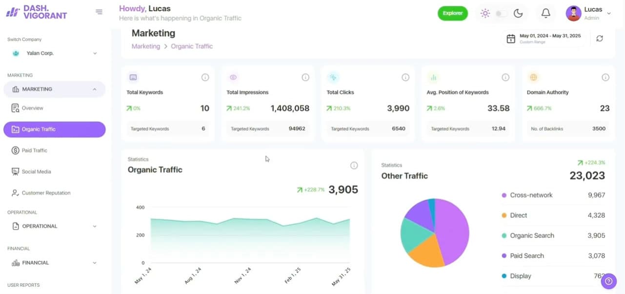
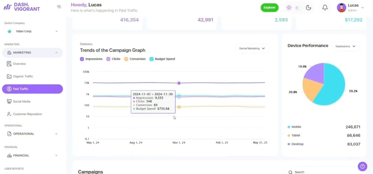
- Reviewed more than 10 patient-portal and practice-management products: what patients expect, and where clinic workflows break.
- Mapped the recurring pains: repetitive paperwork, scheduling by phone, confusing billing and managing family members’ care.
02 · Define
Every journey, for every role, before any screen.
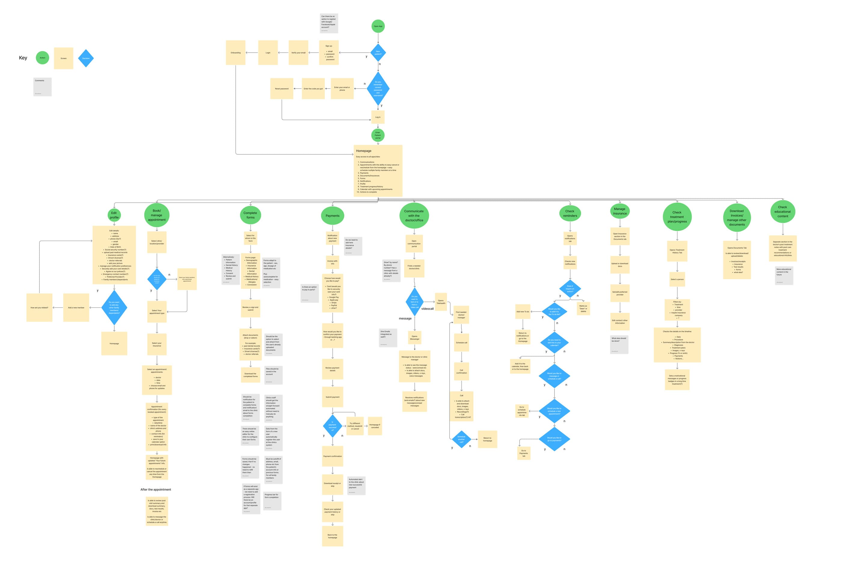
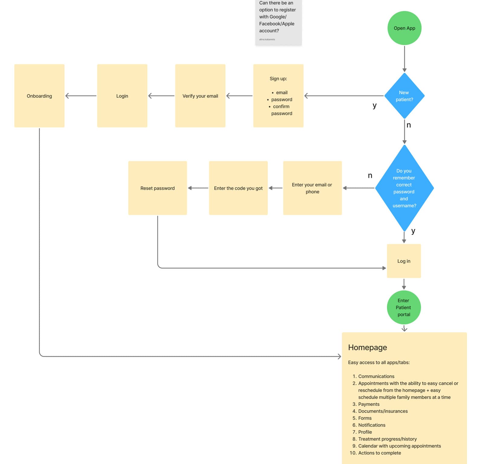
I mapped the full product for patients, clinic admins and providers: every action, decision and edge case, with open questions pinned next to the step they affected.
The hard trade-off: cutting to an MVP
The flows described the whole product. The MVP kept what a clinic needs on day one: appointments, forms, payments, family members and notifications. It deferred messaging and telehealth, treatment history and educational content.
I rebuilt the information architecture and flows around that smaller scope, so the MVP felt complete rather than unfinished, with room for the deferred features to slot back in without a redesign.
03 · Develop
Exploring widely before narrowing.
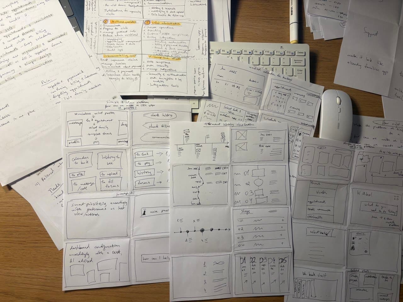
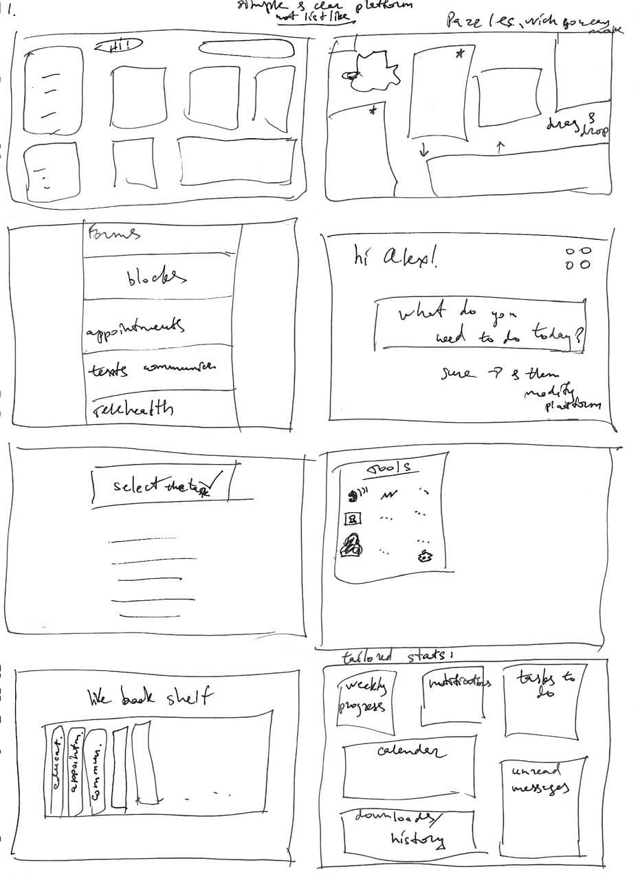
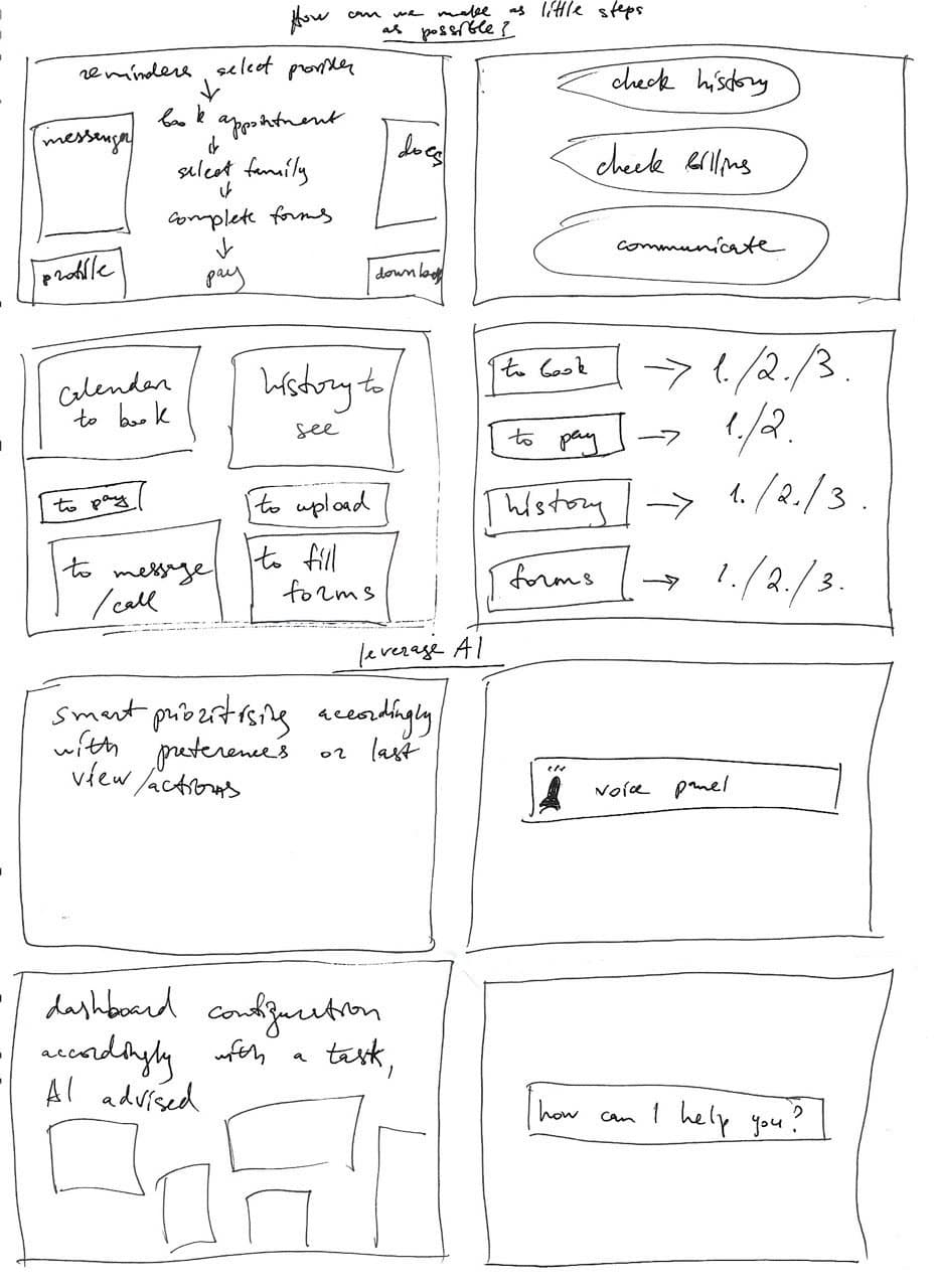
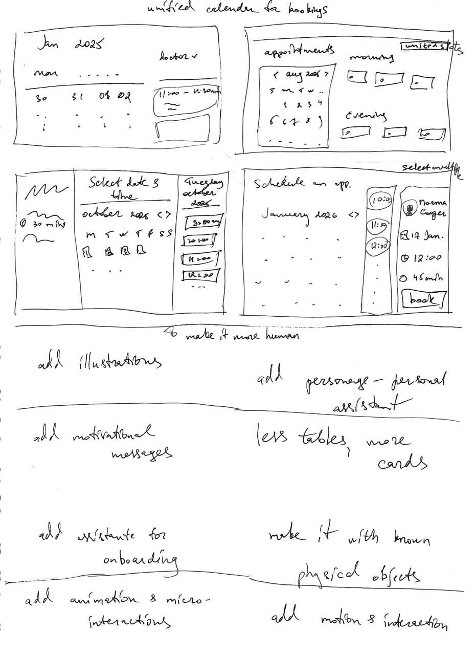
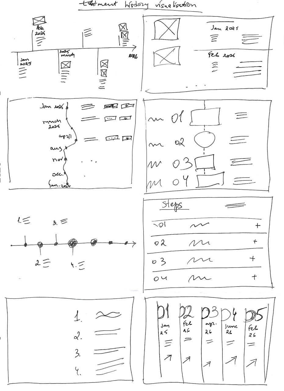
On paper, exploration was cheap. I sketched several models for the patient home, from a “puzzle” dashboard and a bookshelf metaphor to an assistant asking “what do you need to do today?”, and six ways to show treatment history.
Choosing the visual language
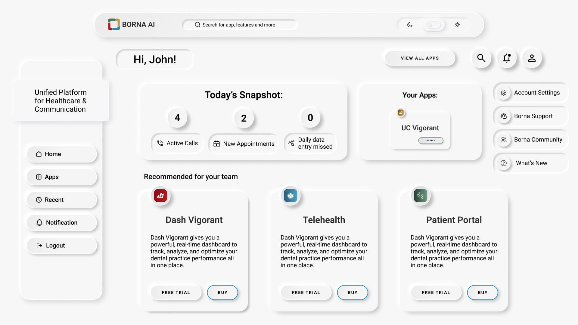
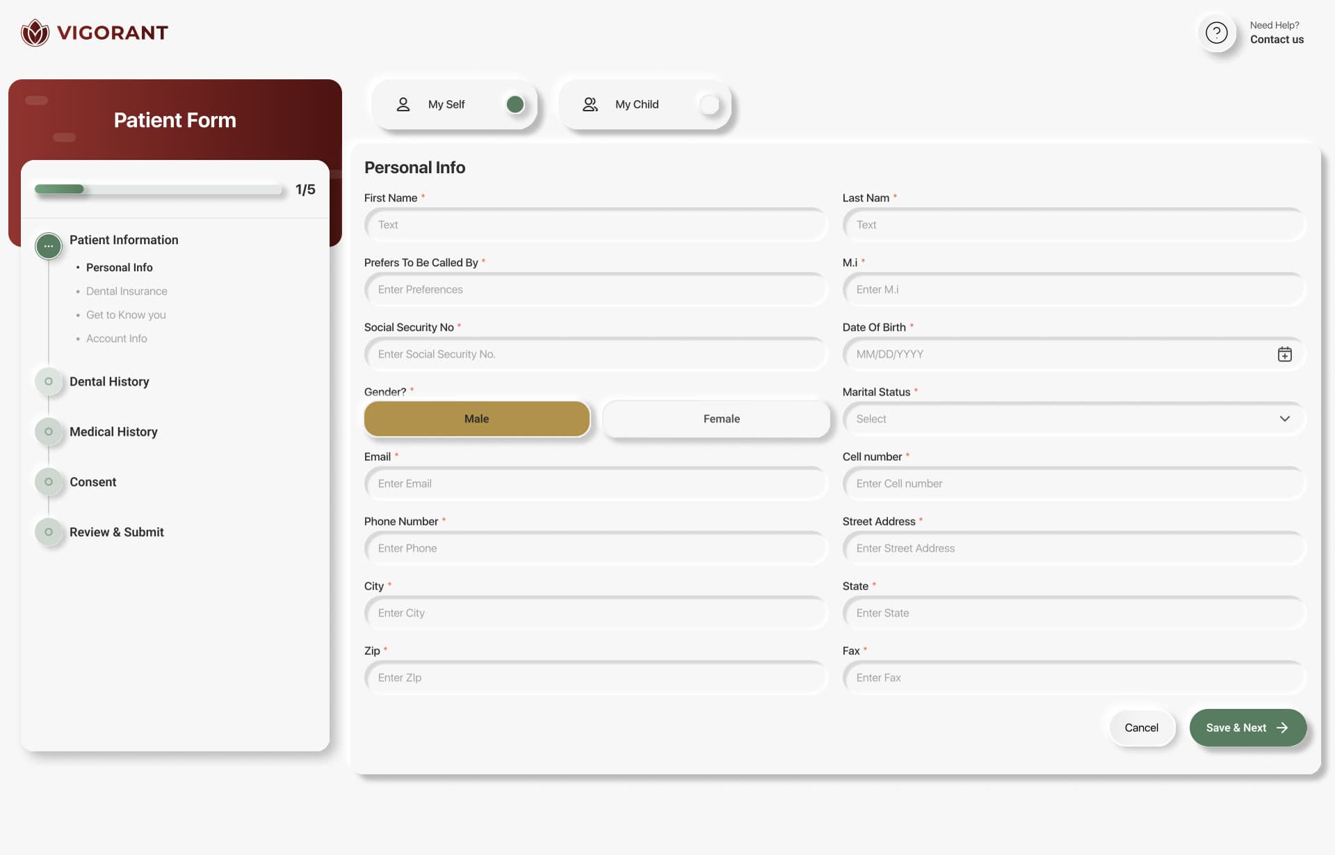
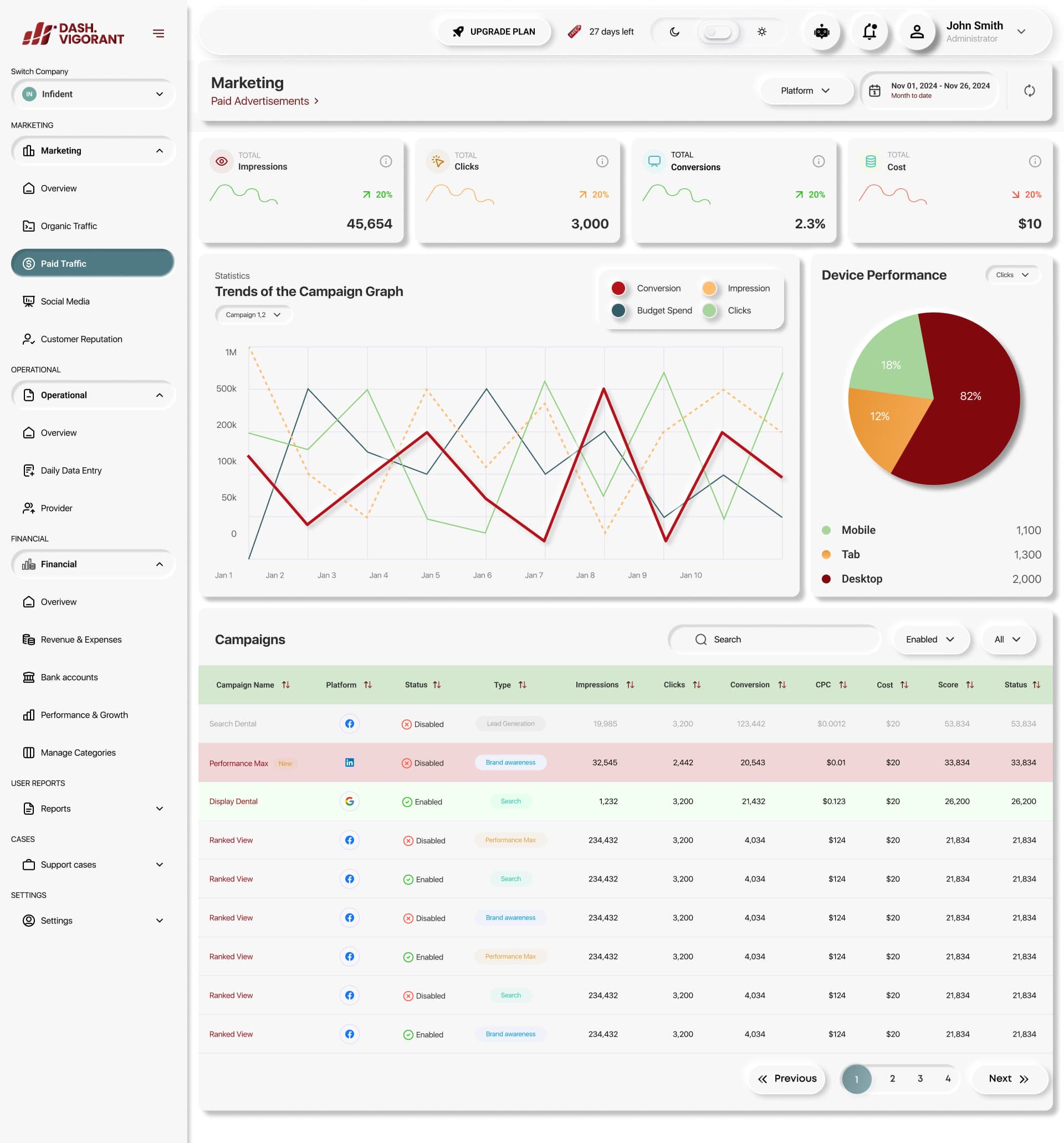
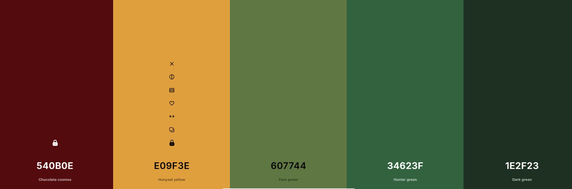
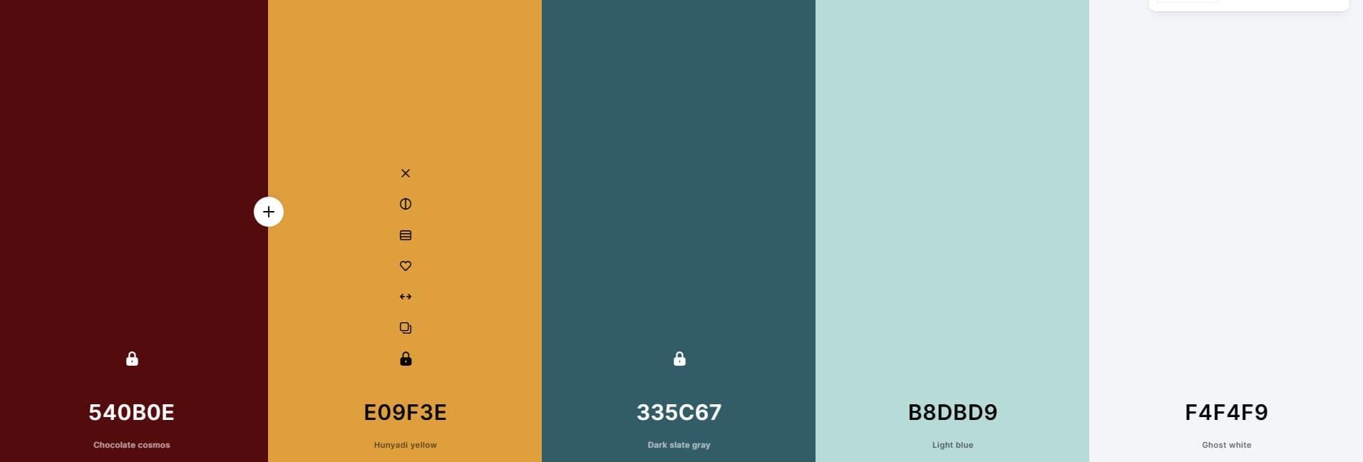
I reviewed how competing products look and was given a free hand to choose the UI style for the new products and their design system. I chose a soft, neumorphic style, and the team approved it:
- Calm and human, which suits clinics and patients better than a dense, spreadsheet-like dashboard.
- Minimal and versatile enough to carry data-heavy admin screens as well as simple patient ones.
Before designing, I checked with the developers how a UI that relies heavily on shadows would perform, so the style was a decision the build could afford.
A design system for five products
I built the system in Figma (colour, type, spacing, components and interaction patterns) and owned it as the product scaled to multi-clinic setups.
Key moments
Two decisions that saved the team time.
Super profiles: redesigning around the clinic
The product grew fast: Forms, then the patient portal, then the admin portal, then multi-clinic support. My first super profile nested clinics inside the owner’s account. As clinics were added, admins needed to work inside a clinic rather than hunt for it. I redesigned the IA, menus and profiles so that entering a clinic became the first step.
RBAC: one table instead of guesswork
Role and permission requirements arrived as long lists per role, with overlaps and the same role under two different names. Rather than design screens on assumptions, I turned them into a comparison matrix of roles and permissions and resolved every open question with the founder and developers. Then I revisited every flow and annotated the handoff.
| Permission | Account owner | Admin | User |
|---|---|---|---|
| Scope | All companies | Assigned companies | Assigned branches |
| Billing, subscription, purchases | ✓ | – | – |
| Create admins, assign the admin role | ✓ | – | – |
| Enable or disable apps and licences | ✓ | – | – |
| Invite and deactivate users | ✓ | ✓ | – |
| Assign roles and seats | ✓ | ✓ from existing licences | – |
| Company, office and app settings | ✓ | ✓ | – |
| Forms, templates, EHR integrations | ✓ | ✓ | View only |
| Payment requests and history | ✓ | ✓ | View only |
| Appointments and daily operations | ✓ | ✓ | ✓ |
| Dashboards and reports | ✓ | ✓ | ✓ own branch |
Engineers implemented it without rework, which saved the team a couple of days.
04 · Deliver
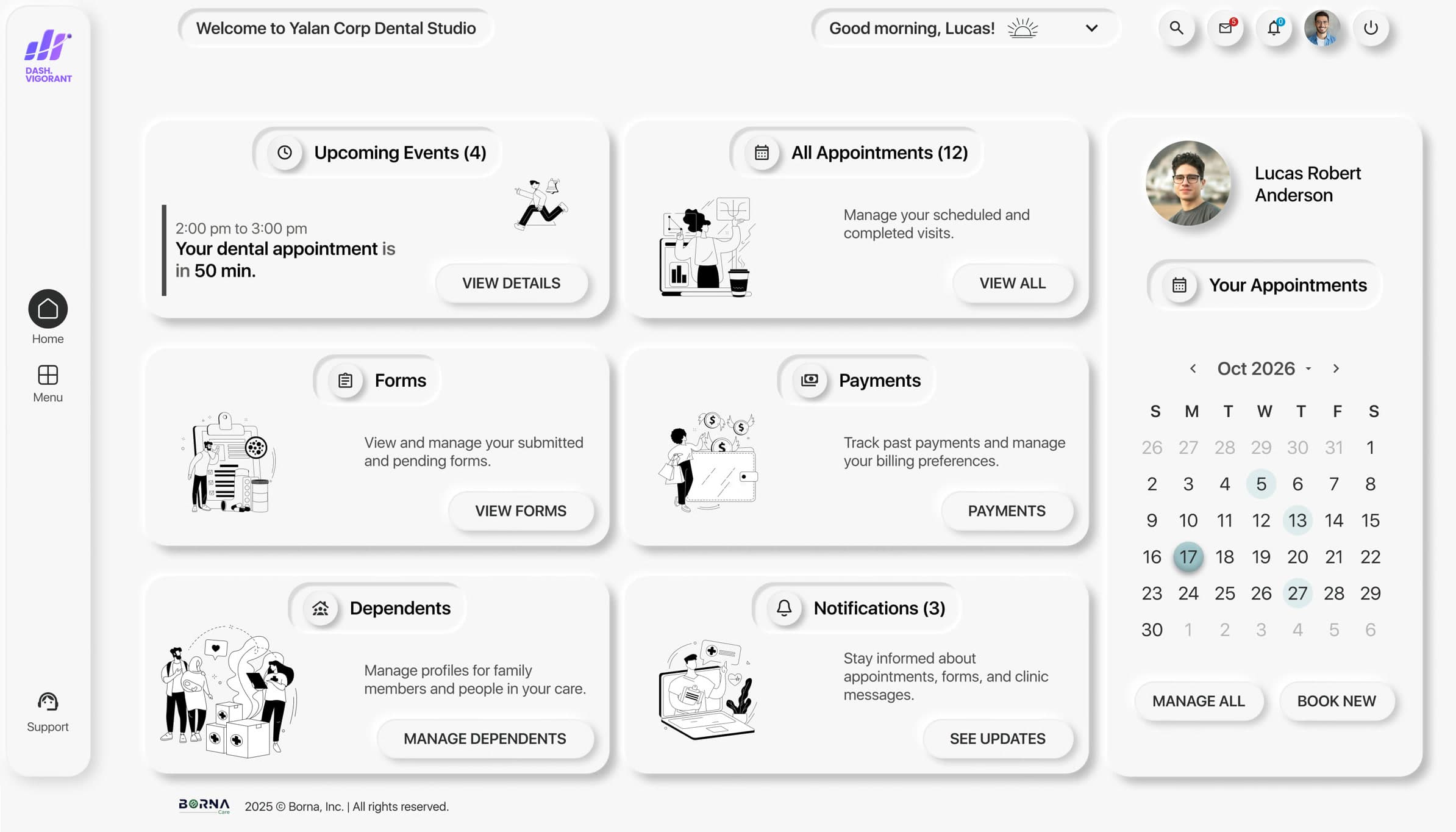
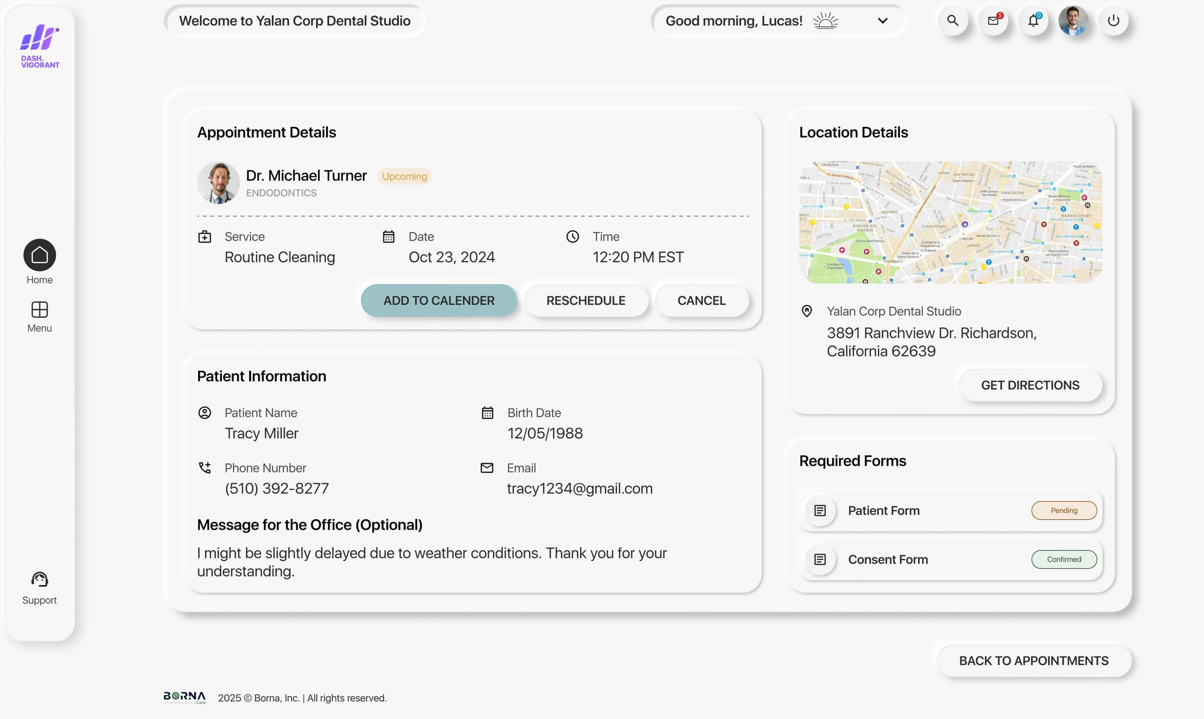
Two portals, shipped in four months.
The patient and admin portal MVPs were ready in February, four months after I started on the product. Then we kept shipping features on top.
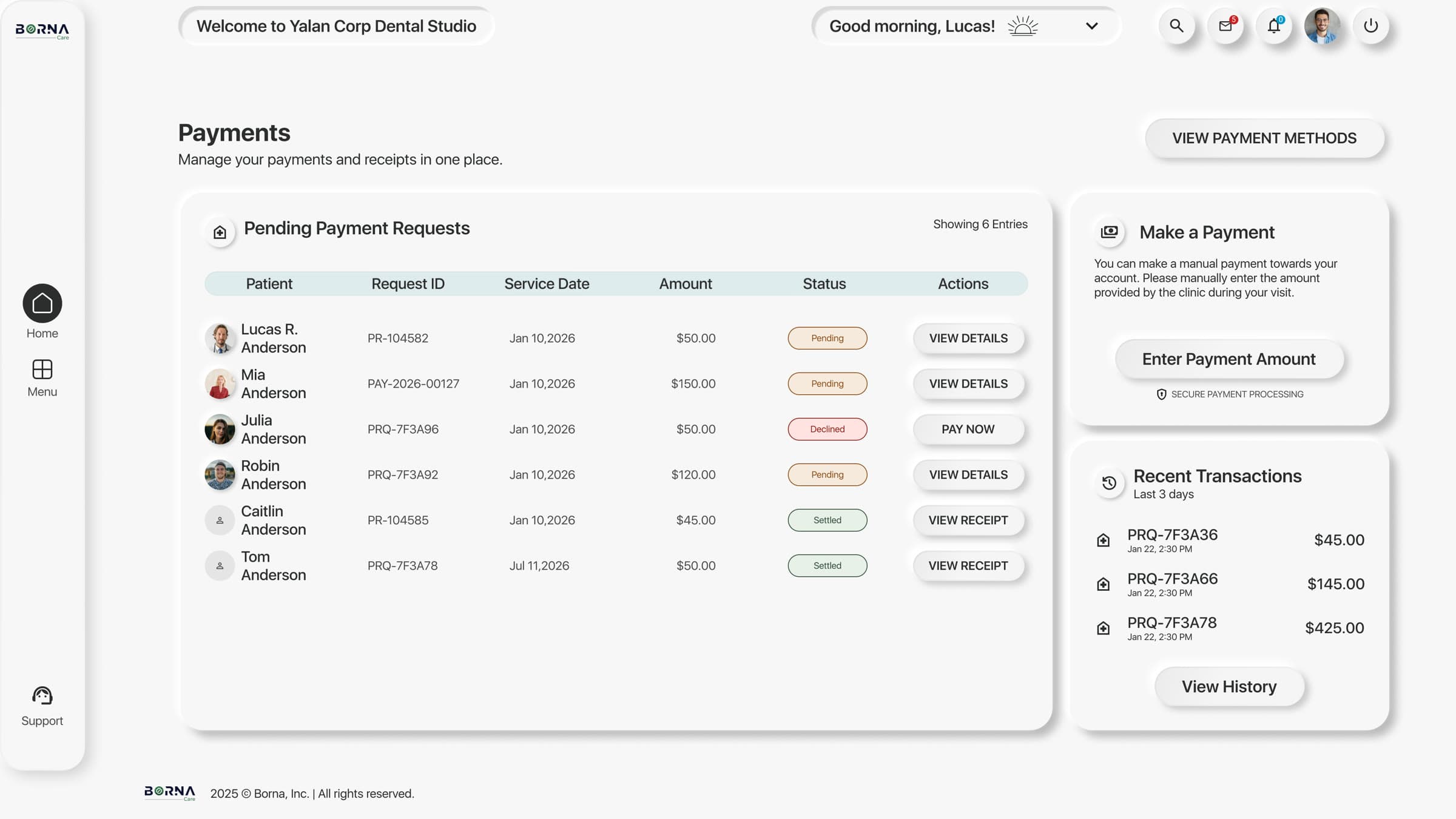
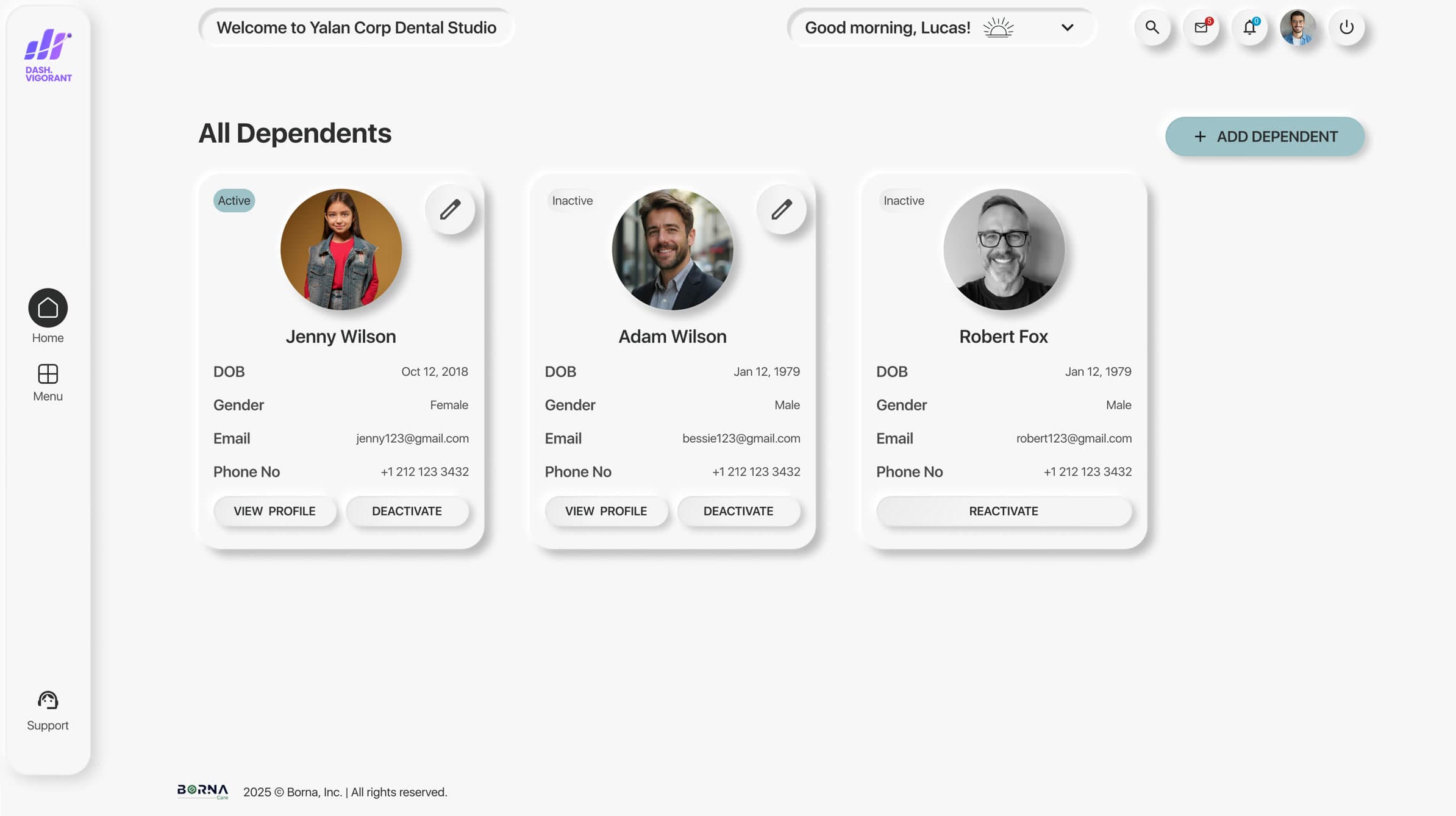
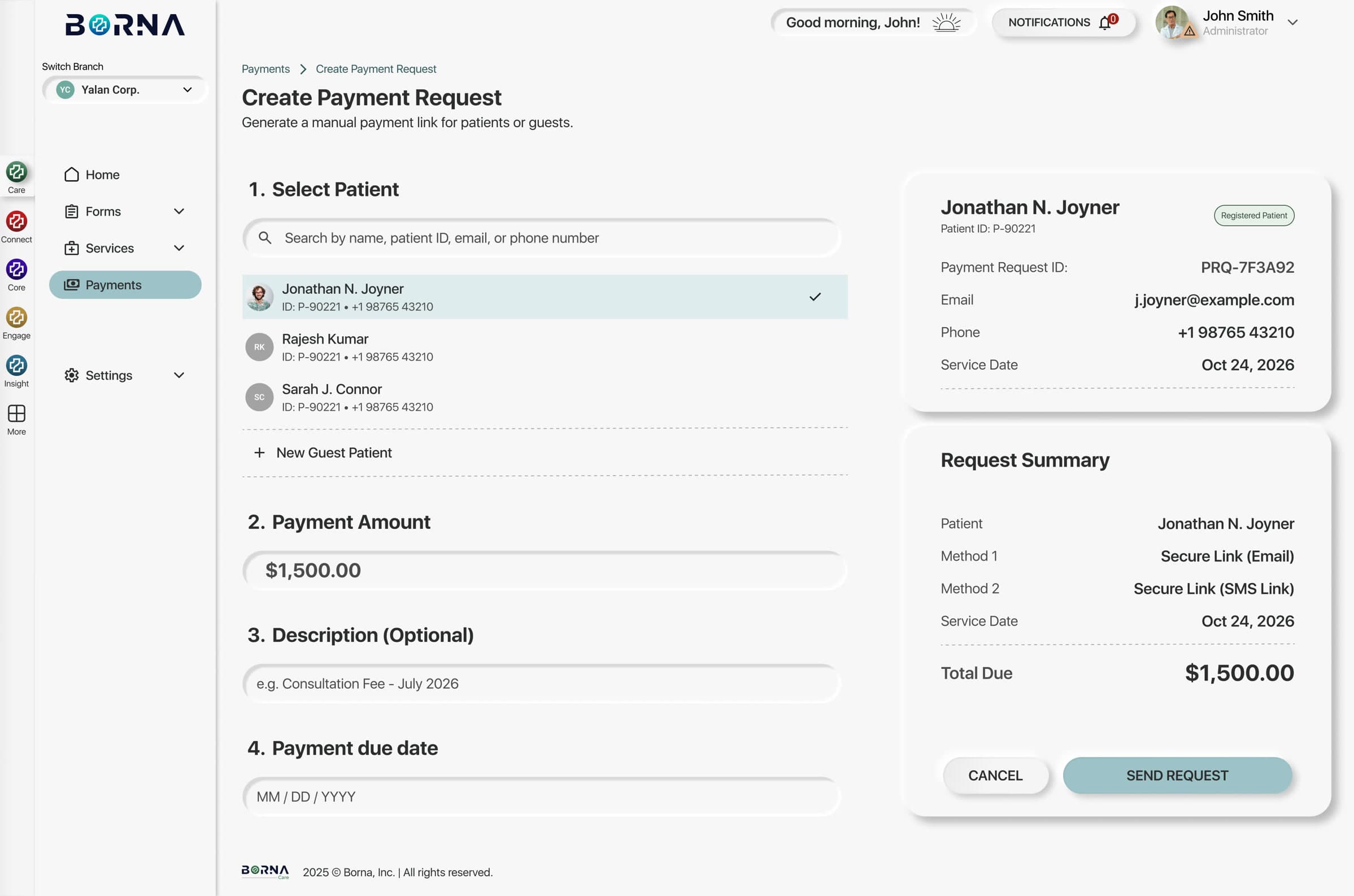
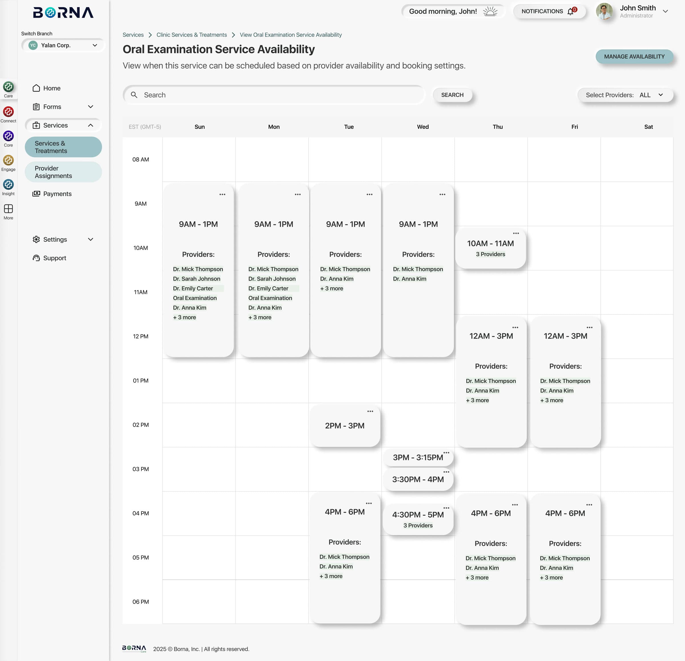
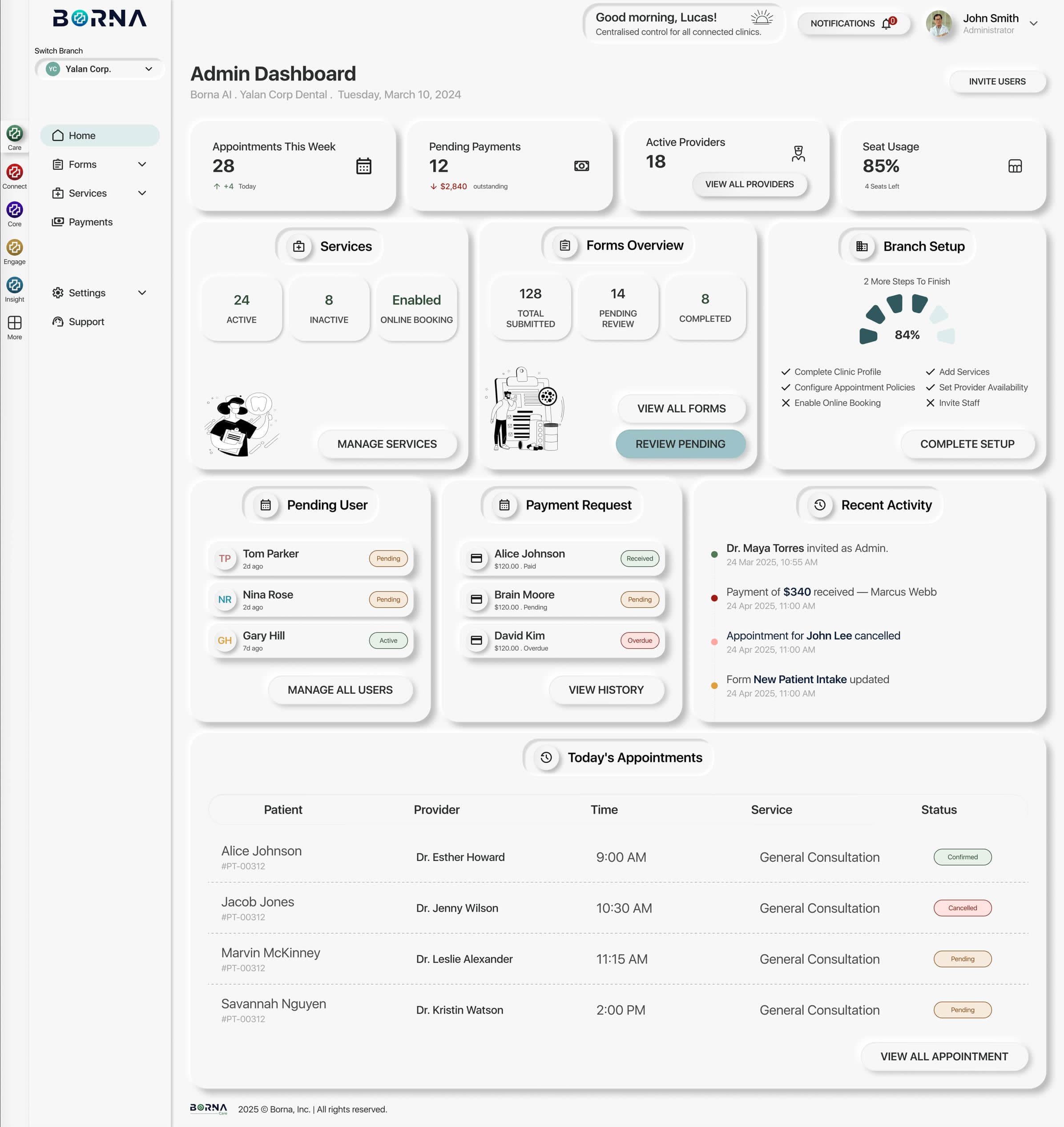
Forms: from exploration to first paying client
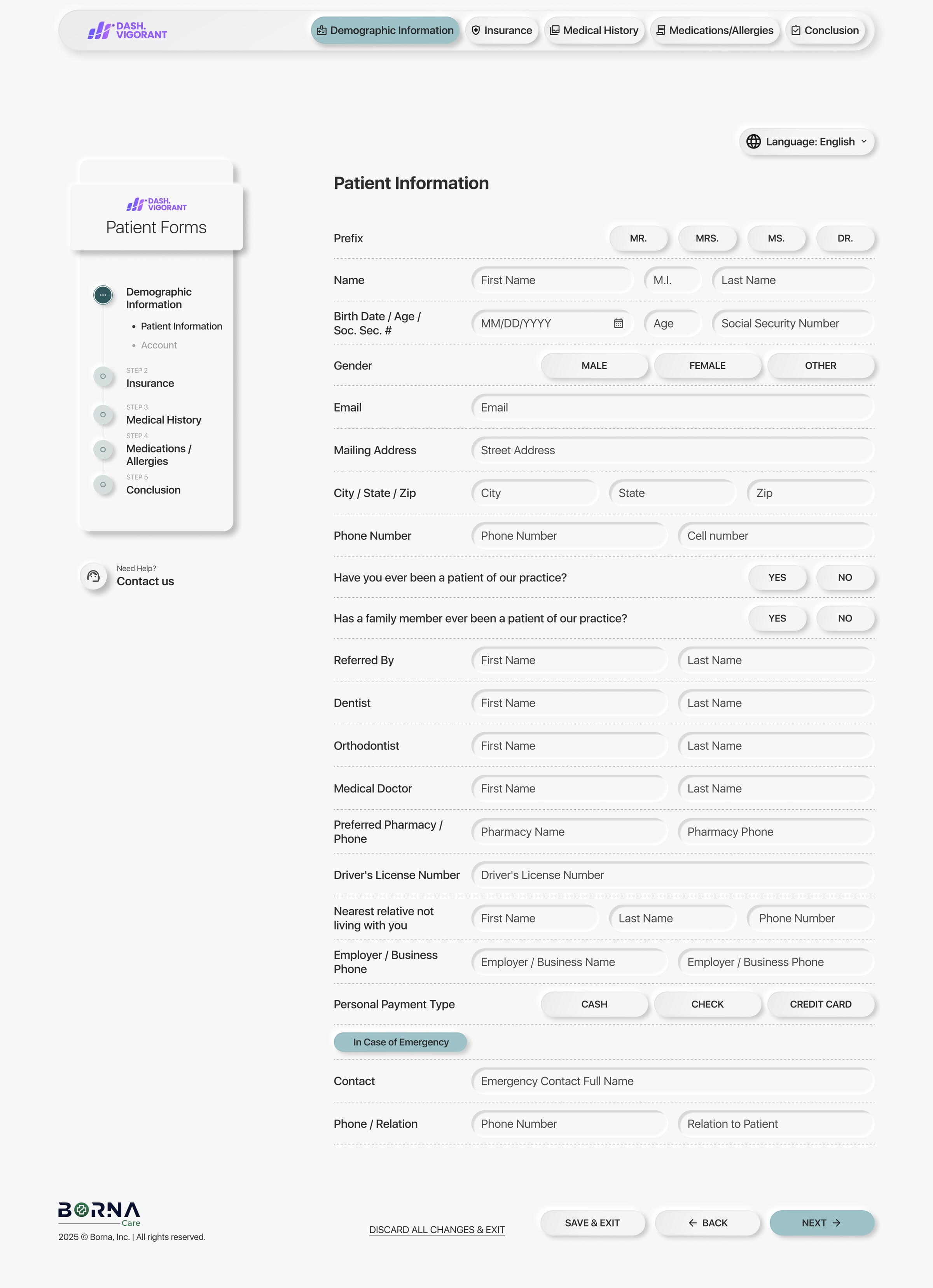
Intake forms became a standalone product, Borna Forms. It was the first part of Borna to be sold, and it won the product’s first paying client. It is live in production today on a client clinic’s website.
Handoff and QA
- Annotated handoffs and component consistency reviews, working directly with both developers on feasibility.
- Fixed a few UI bugs in code myself.
- Tested the built product before launch and logged 60+ bugs in Azure Boards.
Results
What shipped, and what changed for me.
- From a blank Figma file to MVP UI for two products
- 4 months
- From a blank Figma file to MVP UI for two products
- Paying client for Borna, won by the Forms product
- 1st
- Paying client for Borna, won by the Forms product
- Bugs caught and documented before launch
- 60+
- Bugs caught and documented before launch
My role grew with the product. I was given lead product designer responsibilities because the team saw high potential. My work spread beyond design, into product decisions and a few front-end fixes in code. The founder started asking me product questions, like whether to sell features separately or as one package, which is how I started learning product management.
“The progress we made on both MVPs in such a short time speaks a lot about your dedication and ability to take ownership in complex environments. I truly appreciate the effort, creativity, and initiative you brought to the table - not just in design, but in thinking through product challenges and supporting the team.”
Reflection
What I’d do differently.
- Test with real clinic staff earlier. I proposed and planned user testing before launch. Ideally it goes into the plan from week one, not at the end.
- Define success metrics up front. We shipped fast but didn’t instrument the launch. At Deaku I now set activation criteria before designing.
- Next on the roadmap was bringing Dash Vigorant into the new system and designing two more products on the same foundation.
Beyond the brief
Mentored and onboarded a supporting designer · designed three marketing landing pages and an email template · contributed to the logo and brand book · designed the Borna AI website · completed HIPAA compliance training · introduced AI design tools to the team.
“It’s been a pleasure working alongside you and seeing your growth and impact in such a short time. Your contributions truly made a difference.”